Redesign and brand management
Brand redesign for the Pernambuco Taekwondo Federation. Official entity of the sport in the state of Pernambuco, Brazil. Founded on November 28, 1987, in 2022 it completed 35 years of foundation.
Institutional brand rebranding occurred through a set of processes with the purpose of generating value and enhancing a new positioning.
There is a concern with your target audience, with improving communication with your affiliates. Adopt a more current language and enter the digital age once and for all. Firstly, a necessary change was detected in the entity’s acronym, modernization of the logo, adjustments to the institutional colors, with the aim of adapting to the various mobile devices that exist today.

logo-sketch-mockup-1-fpetkd
logo-sketch-mockup-1-fpetkd
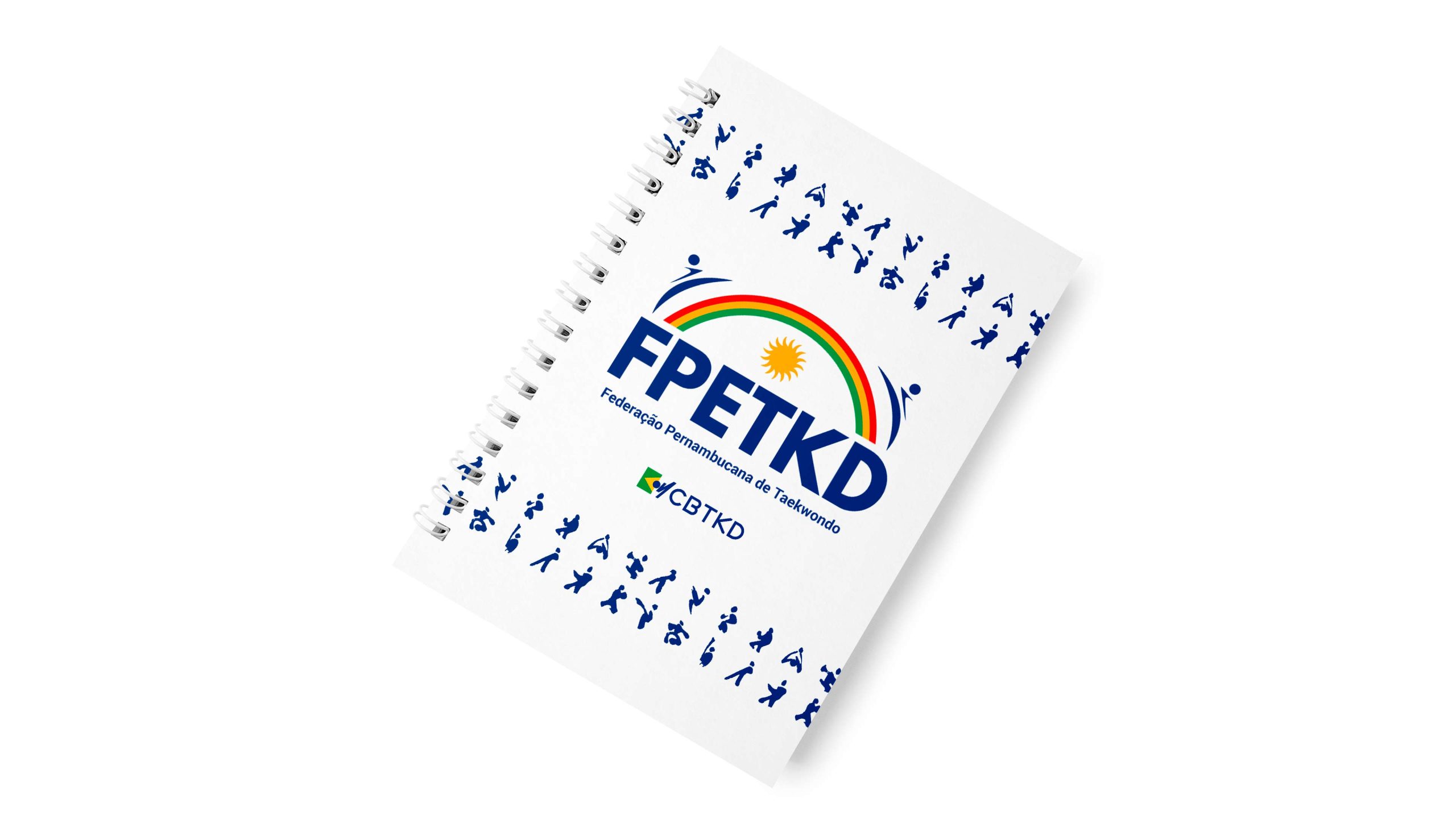
Agenda-FPETKD
Agenda-FPETKD
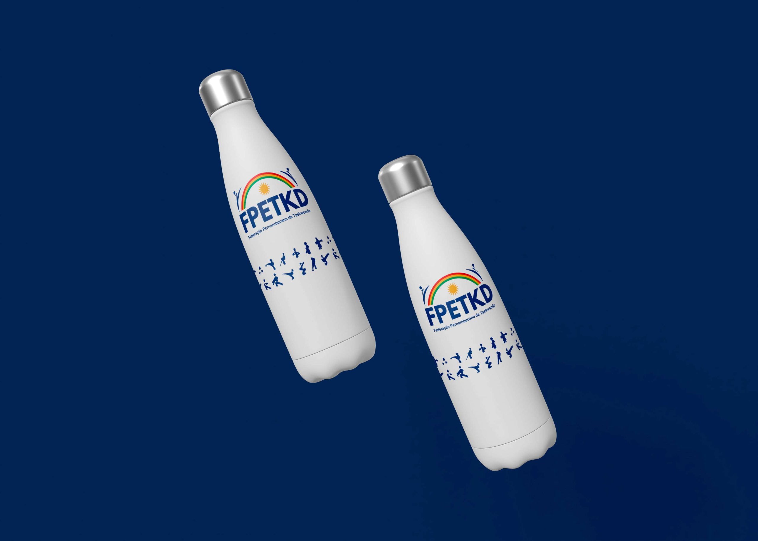
Garrafa-4-FPETKD
Garrafa-4-FPETKD

Caneca-FPETKD
Caneca-FPETKD

snapback-fpetkd
snapback-fpetkd
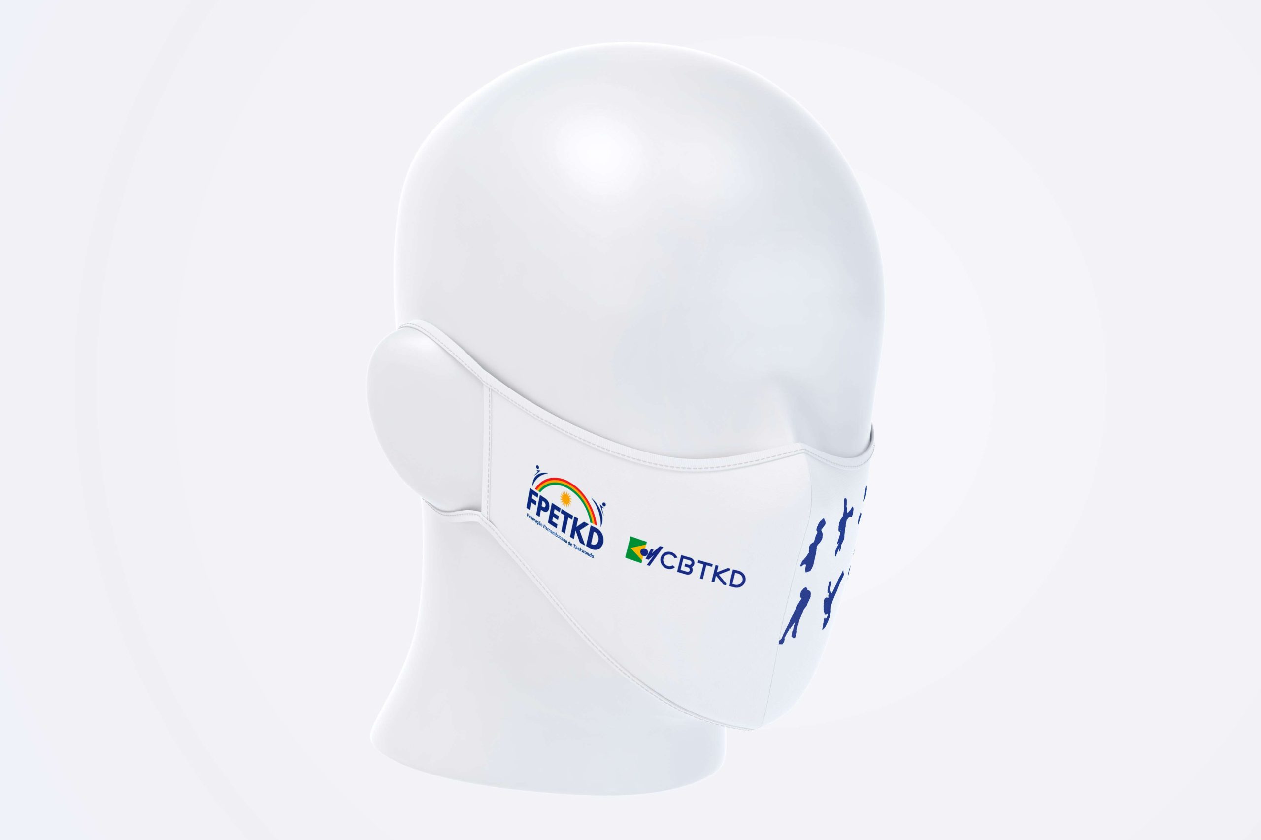
mascara-fpetkd
mascara-fpetkd

Camisa-Atleta-Frente
Camisa-Atleta-Frente
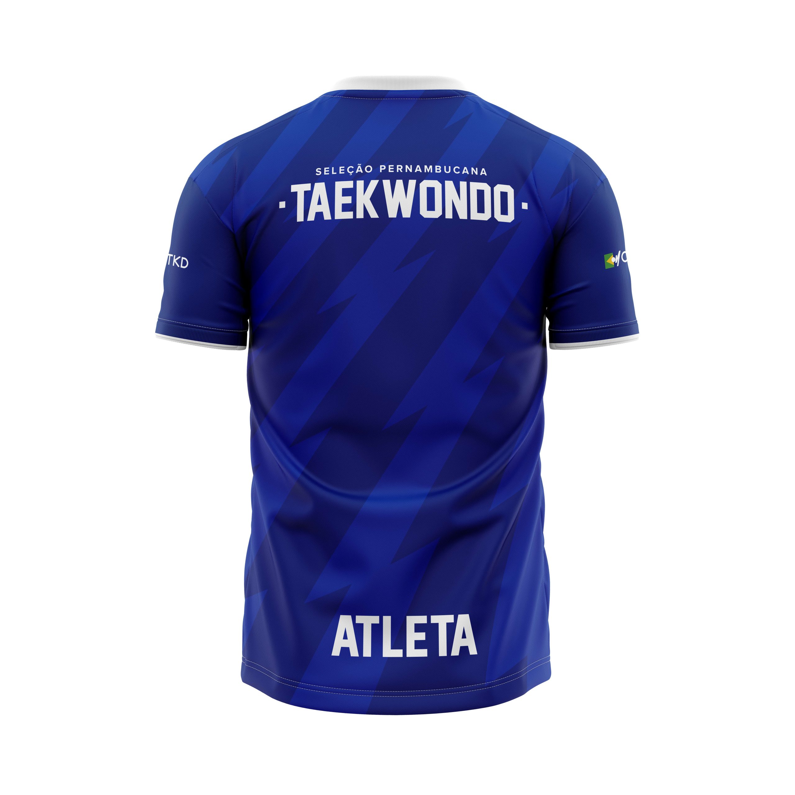
Camisa-Atleta-Costas
Camisa-Atleta-Costas

Saco-Bolsa-FPETKD
Saco-Bolsa-FPETKD

Jaqueta-Costas1
Jaqueta-Costas1
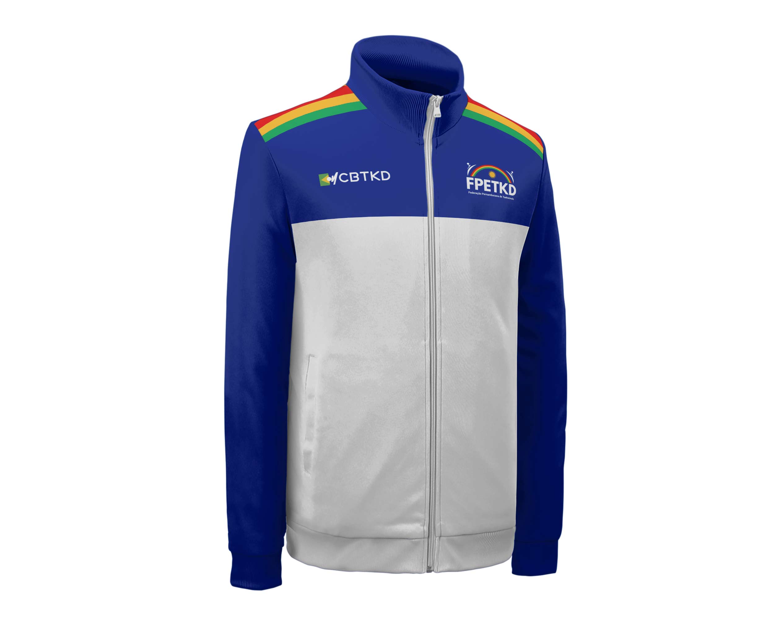
Jaqueta-Frente-1
Jaqueta-Frente-1

tecnico-costas
tecnico-costas

tecnico-frente
tecnico-frente

T Shirt FPETKD
T Shirt FPETKD
Aesthetic changes and addition of elements.
It went from FPTKD (Pernambuco, Rio Grande do Norte “Potiguar” and Paraná) to FPETKD.
Over the decades, the Symbol gained new aesthetic changes and the addition of new elements. The first brand in 1987 was the foundation for the values that are still represented aesthetically today.
Registration in 1991:
“In the center the map of Pernambuco, our house… Home; Above that, the rainbow symbolizing hope and belief in days
best. Below the map are two silhouettes in combat, symbolizing the tireless willingness to protect our land and our people. In the center of the two silhouettes, the Olympic rings, representing the character of an entity officially recognized by the Brazilian Olympic Committee. At the bottom of the outer circle, two asterisks, representing the Poomsae Hansu diagram, whose meaning concerns water as a source of substance that preserves life and growth. Thus, Hansu symbolizes the birth, growth and strengthening of life, IMMORTAL PERNAMBUCO, IMMORTAL! Also below in the outer circle, the date of founding of the Pernambuco Taekwondo Federation.”
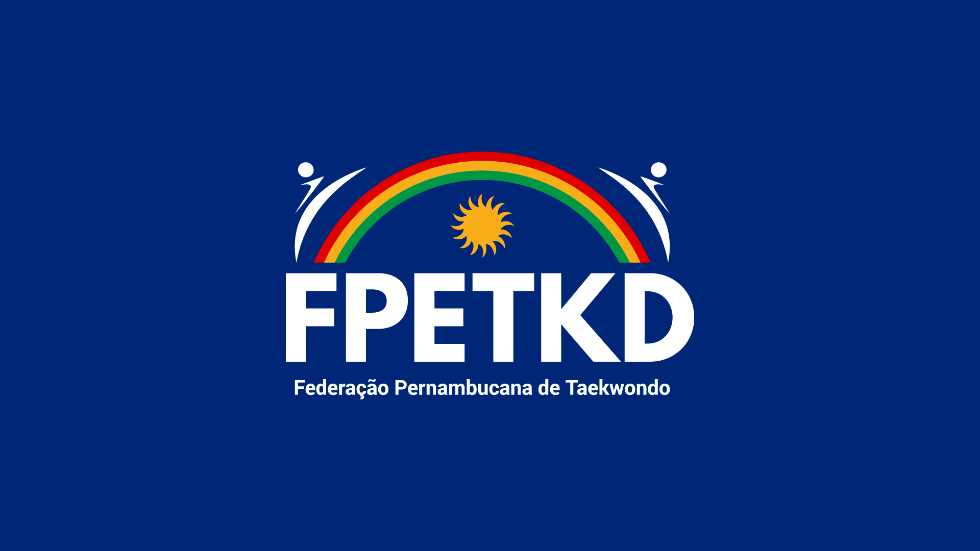
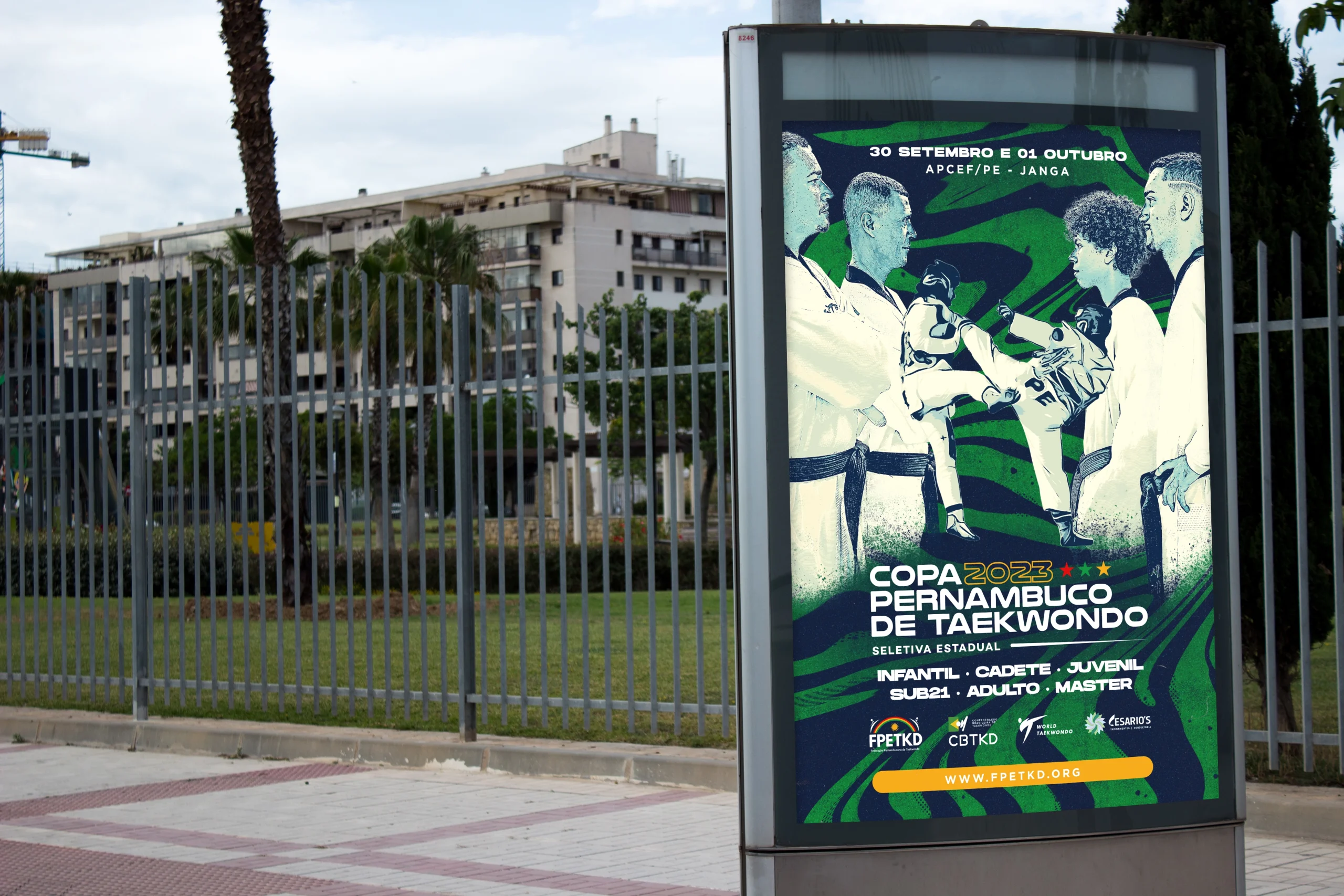
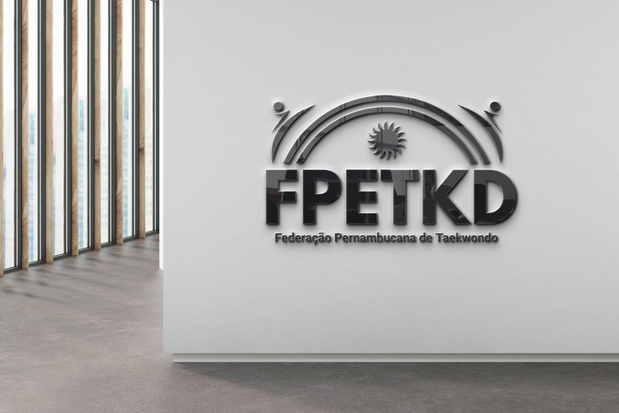
In 2022 the Sun was inserted into the brand, representing the values of justice and energy. The acronym FPTKD was changed to FPETKD. The letters in Korean that represented the name of the modality were removed for better readability. A new typographic family was inserted, taking on a new color as its base.



The Technical Sheet
Client
— Victor Amorim
President
— Roberto Santana
Public Relations Director
Client
— Waldomiro Amorim
Vice President
Creative Design
— Paulo Lima
Designer
